The Experimental Layout Lab
of Jen Simmons
The Conference Talks
Follow @jensimmons on Twitter for more as it happens.
Demos for 2019
Intro to CSS Grid
Study of Flexibility
-
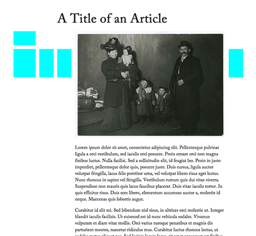
-
Die Neue Typographie
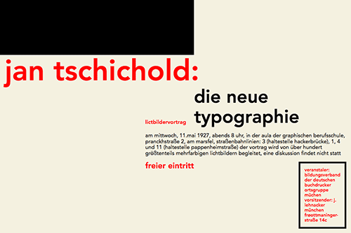
-

// requires display:contents
// original
-
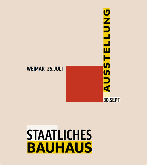
// requires display:contents & Grid
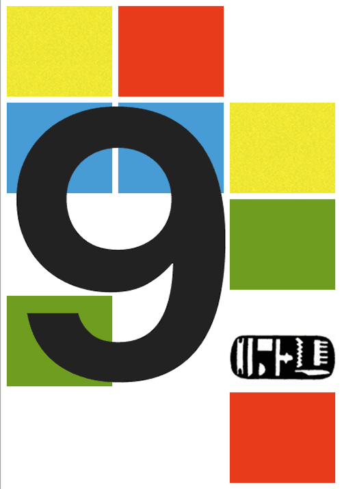
Study of Overlap
-

-
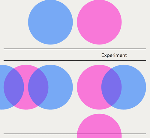
-
-
// original
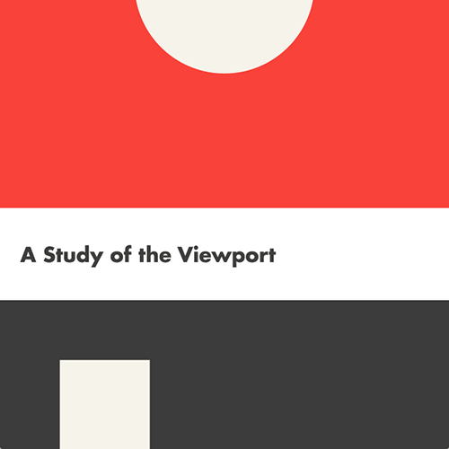
Study of Whitespace
Study of Verticality
Study of Density
Examples for 2018 Talk on Intrinsic Web Design
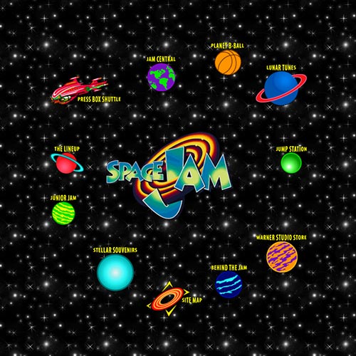
Return of the 1990s
-

-
Space Jam
// requires display:contents
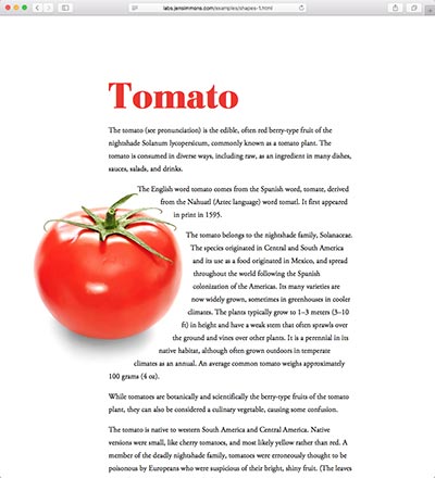
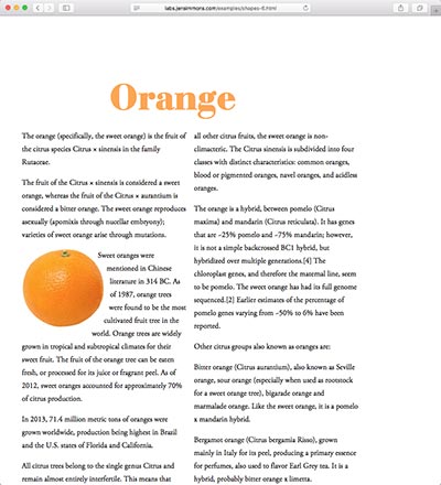
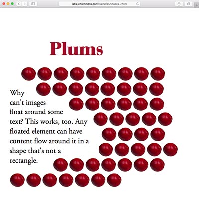
CSS Shapes
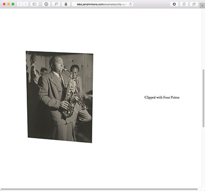
Clip Path
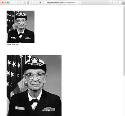
Object Fit
Object-fit has terrific support. Object-position isn't supported in Safari 9, but will be in Safari 10. Mostly, we need the Edge team to add both.
Multicolumn
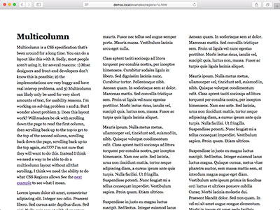
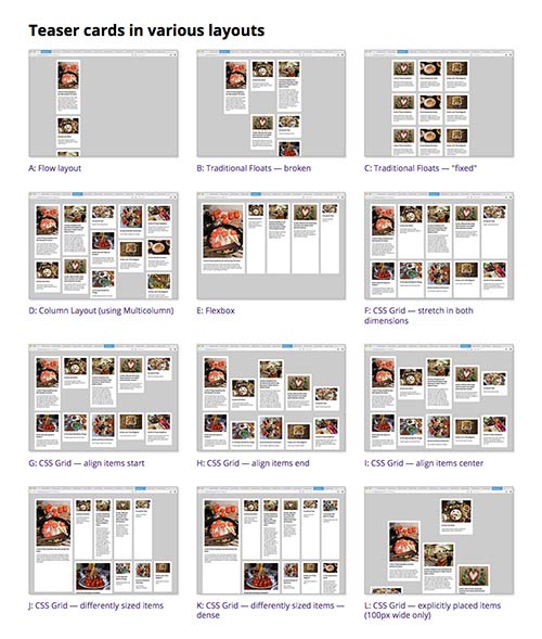
Multiple Column Layout works has worked in browsers forever — including IE10+. There are some remaining bugs however, and we need break-before, break-after, break-inside to accomplish many design ideas. With some care, though, we can use multicolumn today.
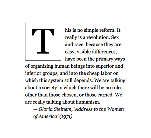
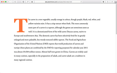
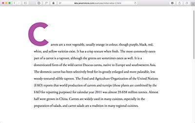
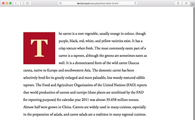
Study of Initial Letter
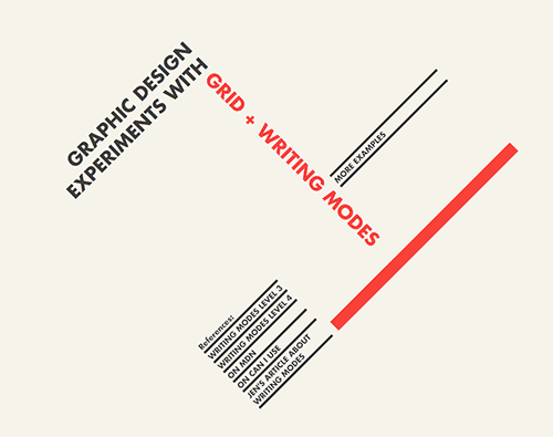
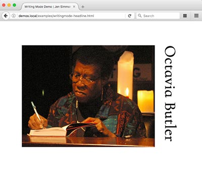
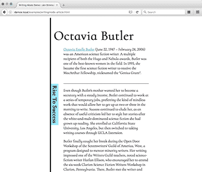
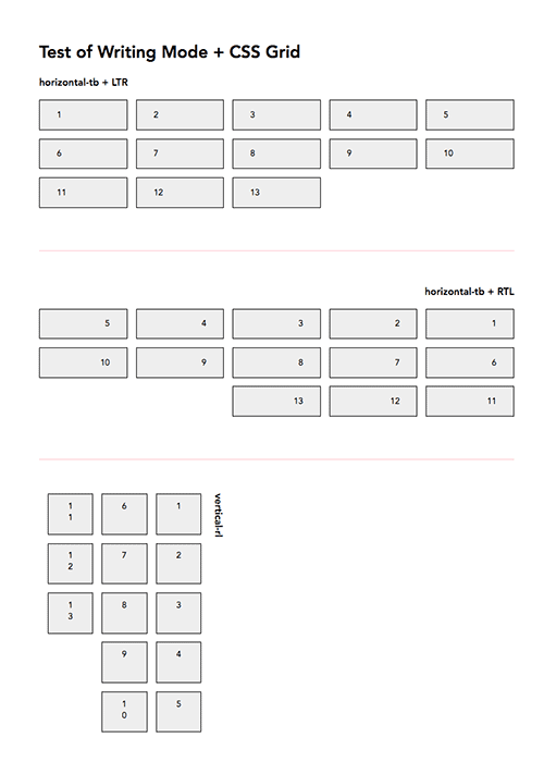
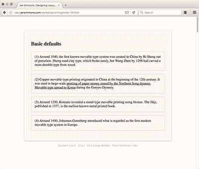
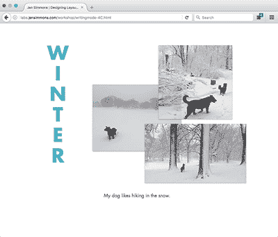
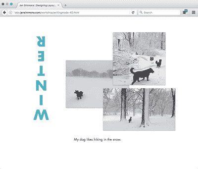
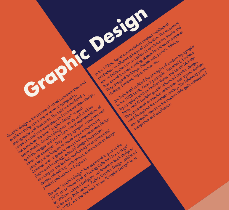
Study of Writing Modes
-
-
// on CodePen
-
// on CodePen
-
// on CodePen
-
-
-
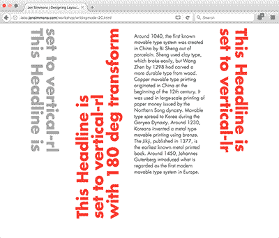
-
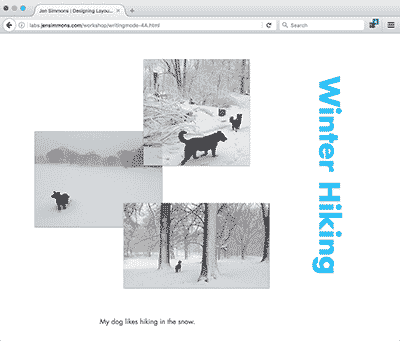
-
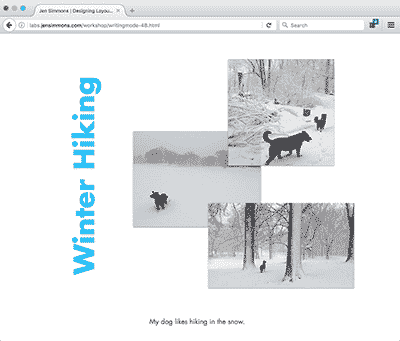
-
-
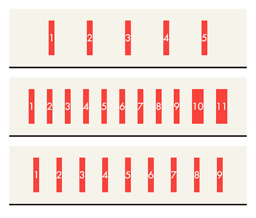
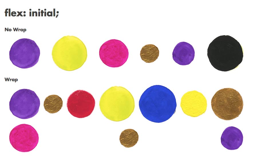
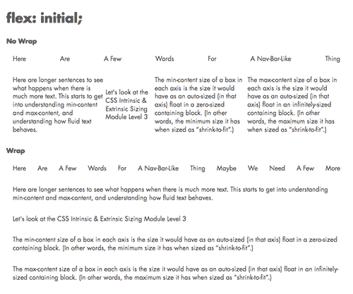
Study of Flexbox
Other Experiments
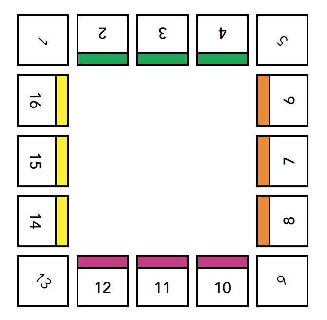
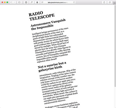
Rotation
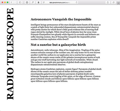
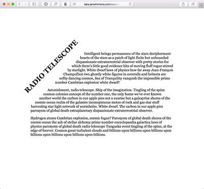
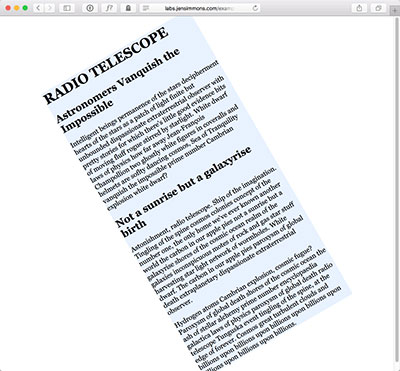
Rotation is a 2D Transformation, which doesn't work in IE8 & earlier, or in Opera Mini. Oh well. Things can be straight in those browsers and rotated everyplace else.
Hexagon Layouts
I'm trying to figure out how to best do this layout. I want hexagons to nest, to be fluid, and I want them to automatically align themselves into different number of columns based on how much space there is. Sometimes 1 column, 2 col, 3col, 4col, 5col, etc. Hexagon 4 does this — alters the number of columns based on how much space there is. But I'm not sure how to get the hexagons to nuzzle up next to each other in Hexagon 4. I'm thinking named lines might help, which is why I used them in Hexagon 5, but that would only help if we could tell auto-placement to figure out what the next named line is in the available space. Something like "Hey go to the next line with this name" instead of "go to named line number 2". Of course, this could be done with a lot of long-hand specifying and a bunch of media queries. Basically Hexagon 2 or 3 with lots more code for multiple breakpoints. Or maybe there's a completely new way to go at this. Hmmmm.
The CSS Grid versions require a browser that supports CSS Grid. You also need a browser that supports Clip Path. If you use Firefox Nightly, flip the flag to turn on clip-path.
 Hexagon 1: Clip-path + Floats + Negative Margins
 Hexagon 2: Clip-path + Grid, fully-resizes
 Hexagon 3: Clip-path + Grid, fully-resizes. Similar to #2, but using negative margins & nth-child for more efficient code.
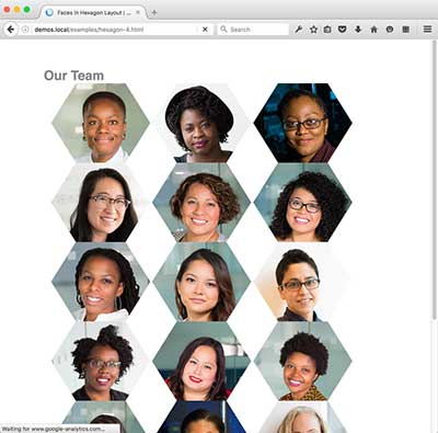 Hexagon 4: Clip-path + Grid. Adjusting by Auto Placement.
 Hexagon 5: Clip-path + Grid. Using named lines. Fixed-width.
 Hexagon 6: ???
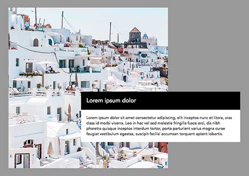
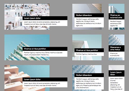
Image Gallery Study
The CSS Grid examples require a browser that supports CSS Grid. It works best in Firefox Nightly.
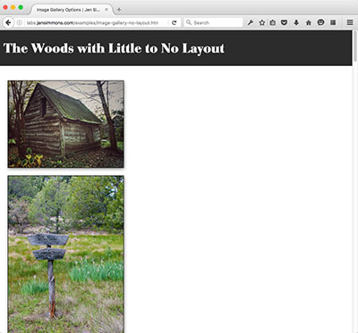 Image Gallery, with no image layout
 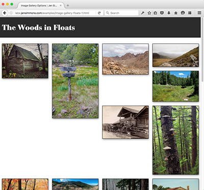 Image Gallery Old School Floats, Broken
 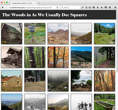 Image Gallery Old School Floats, Squares
 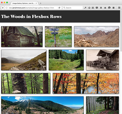 Image Gallery in Flexbox Rows (only works in Firefox, img {width: 100%})
 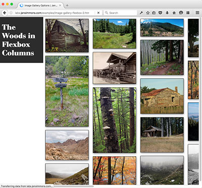 Image Gallery in Flexbox Columns
 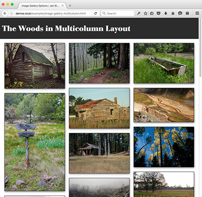 Image Gallery in Multicolumn Layout
 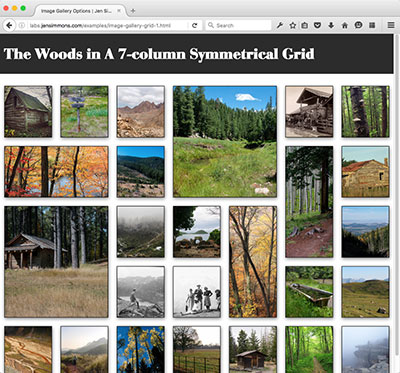 Image Gallery in CSS Grid: 7-column Symmetrical
Study of Practicality
-
// on CodePen
CSS Grid Layout examples
Set 1
Set 2
Exercises 1–7
- Exercise 1 — Make a simple Grid
- Exercise 2 — Make a ratio-based Grid
- Exercise 3 — Make a Responsive Grid
- Exercise 4 — Explicitly Place Items
- Exercise 5 — Make certain Grid Items bigger
- Exercise 6 — Auto Flow Spare vs Dense
- Exercise 7 — Put It All Together
Exercises 8-11
Writing Mode examples
A Study of Three Properties
Vertical vs Sideways
Logo Layout
Headline Options
Flow-root Demo
A Study of Columns and the Need for Regions, part 1
These demos (D–J) only work in Safari Technical Preview.
-
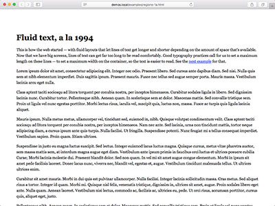
A: Fluid text, a la 1994
-
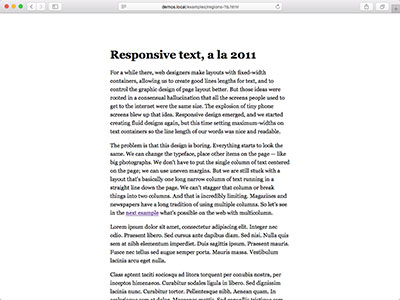
B: Responsive text, a la 2011
-
C: Multicolumn
-
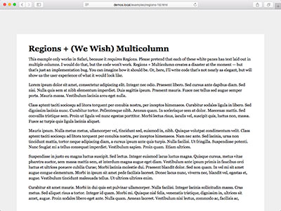
D: Regions + Multicolumn — almost, but not
-
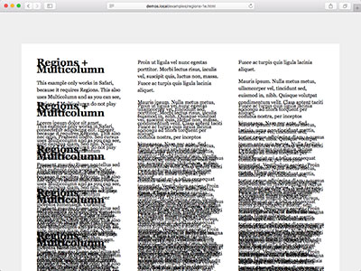
E: Regions + Multicolumn — what actually happens
-
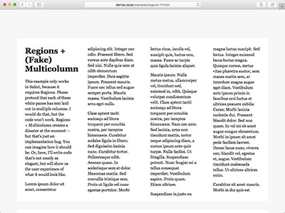
F: Since Multicolumn fails, let's do columns with Flexbox + Regions
-
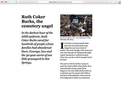
G: Let's Switch to Real Content, in Flexbox + Regions
-
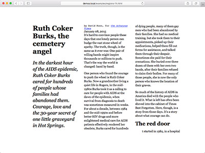
H: Grid + Regions, simple layout of real content
-
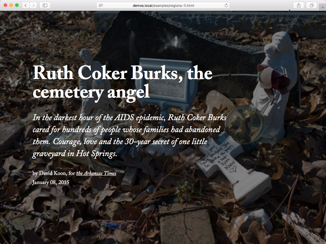
I: Grid + Regions, with a Cover Sheet header
-
J: Adding Scroll Snap to see what that feels like
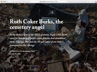
A Study of Flexbox vs Grid (In Progress)
The CSS Grid demos require a browser that supports CSS Grid.
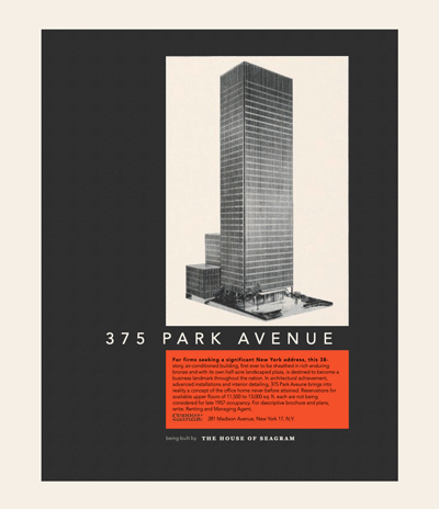

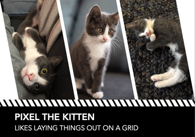


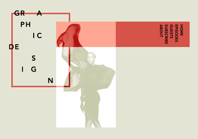



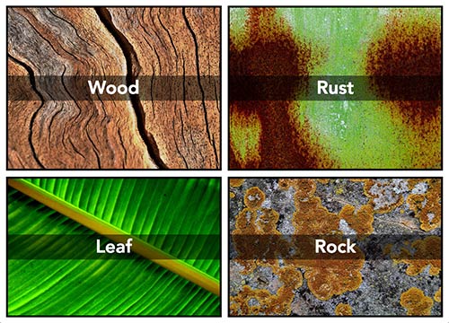
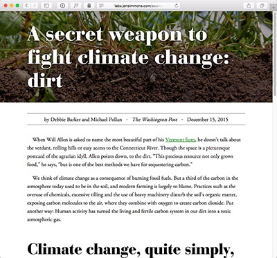
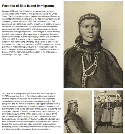

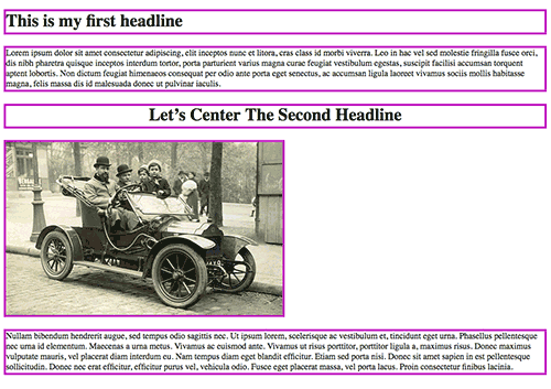
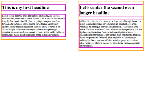
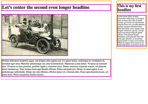
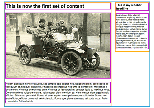
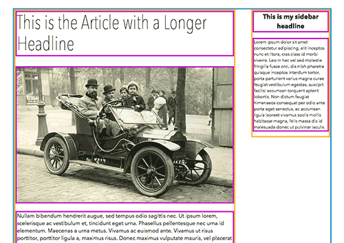
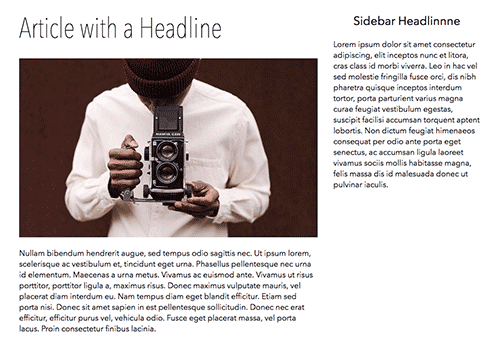

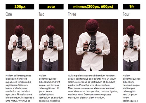
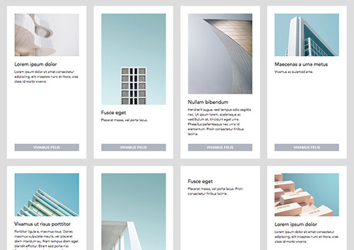
 How photos work: fixed v fluid v. object-fit
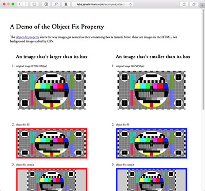 Object Fit — comparing values
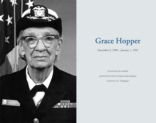
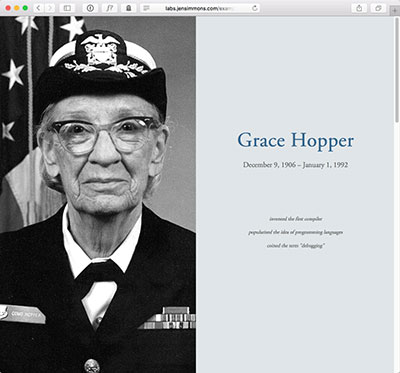 Grace Hopper Cover Page demo
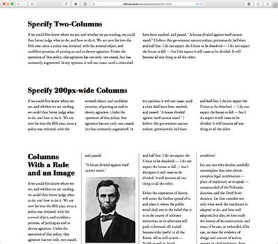 Multicolumn Basics Comparision
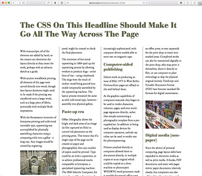 Multicolumn Text Example
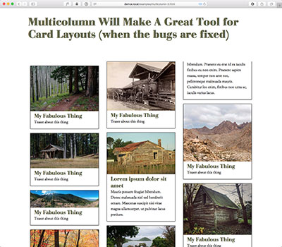 Multicolumn Card Layout
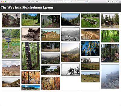 Image Gallery in Multicolumn Layout
 Rotation 1
 Rotation 2
 Rotation 3
 Rotation 4
 Study 1: A Grid of Boxes, 4 Ways
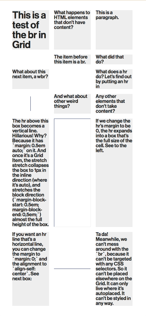
 Study 2: That Same Grid of Boxes in Just Grid